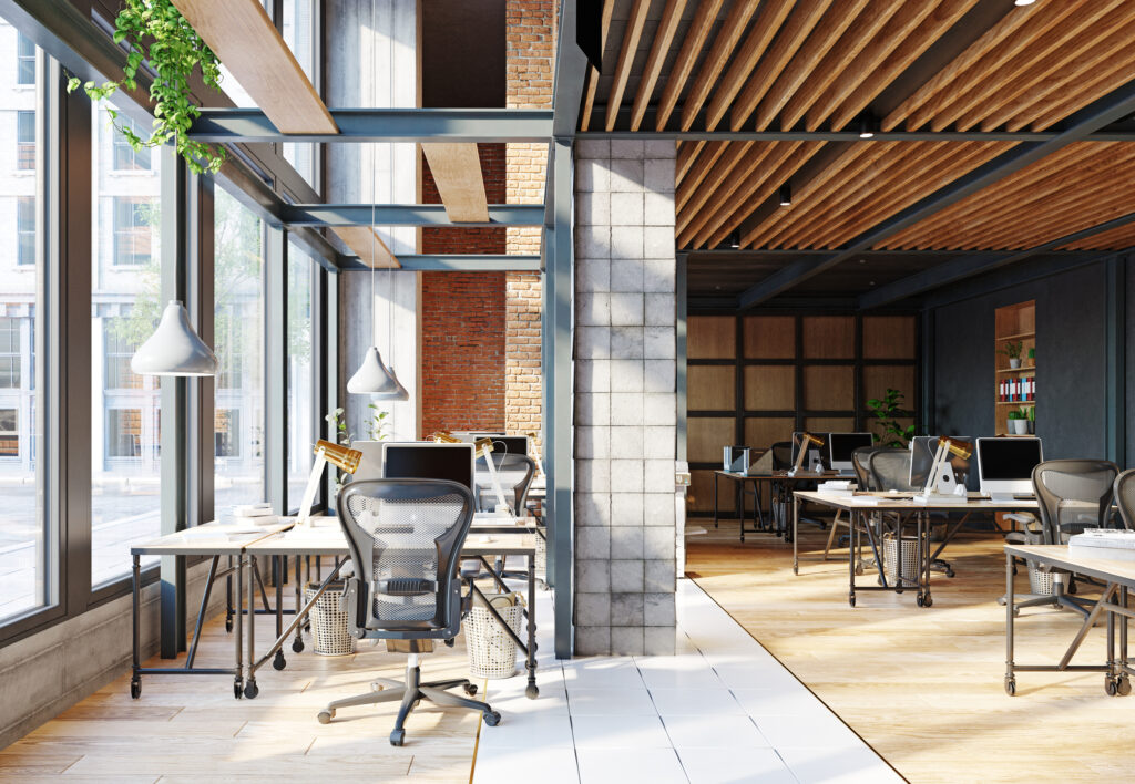
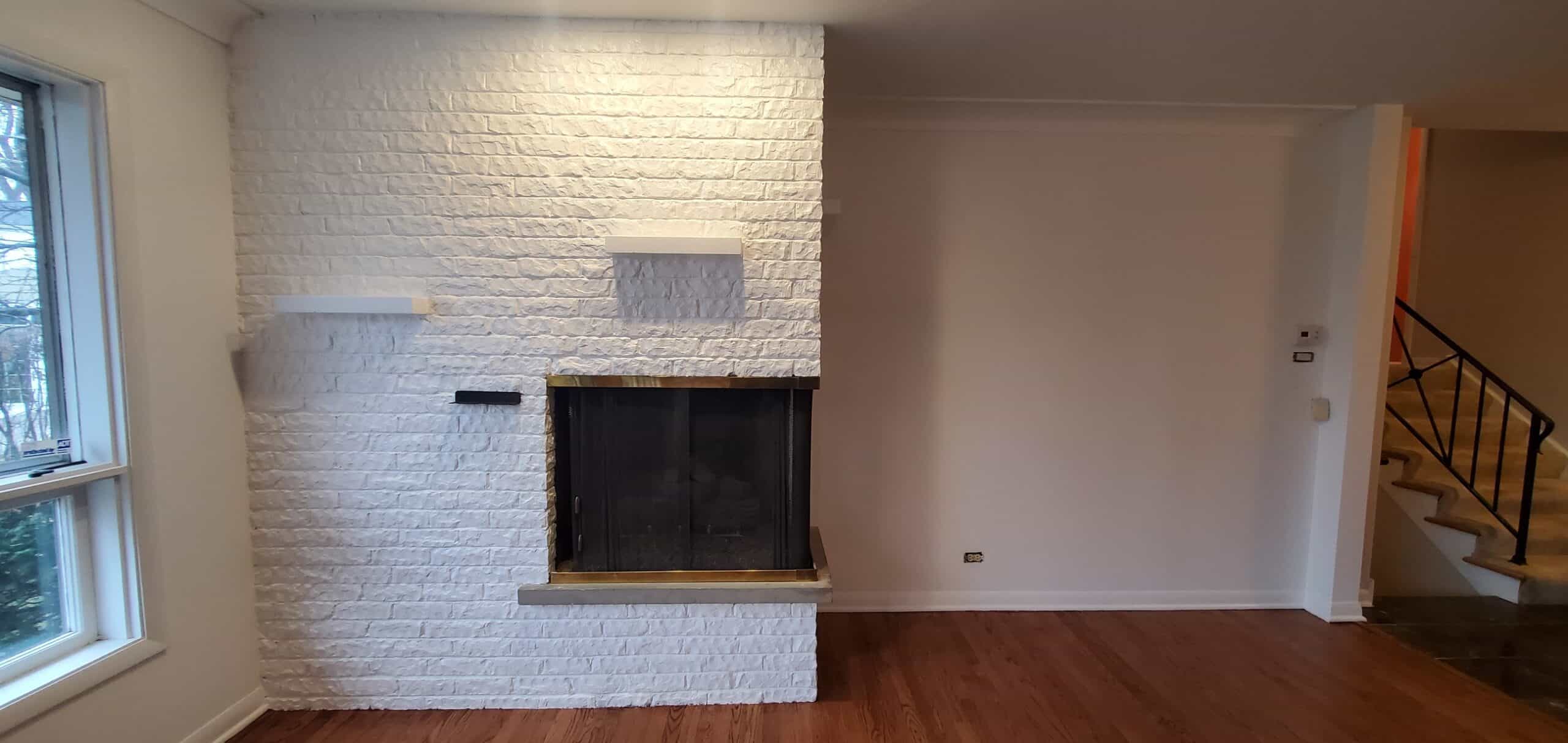
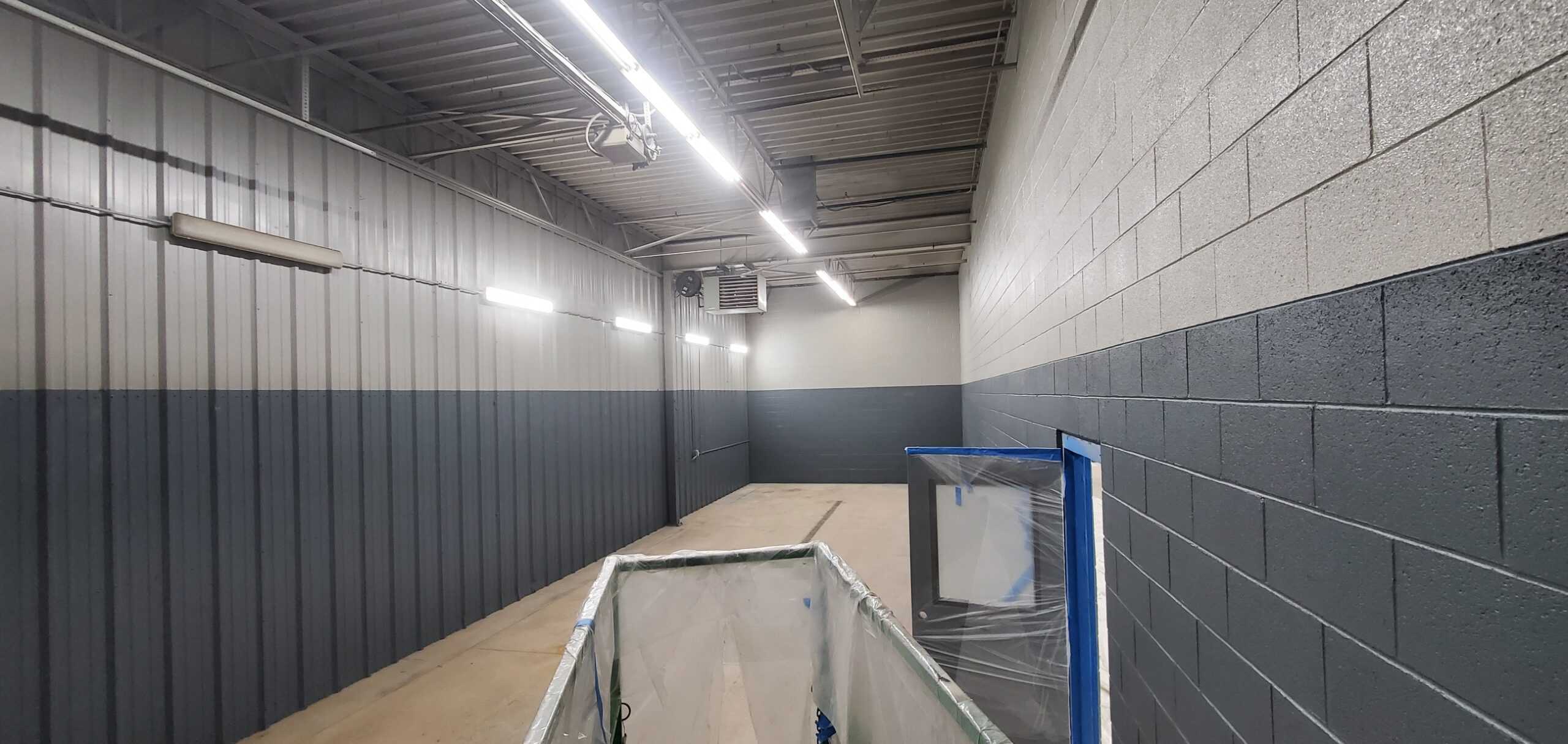
When it comes to interior commercial painting projects, choosing the right office paint colors for lighting goes beyond mere aesthetics; it’s a crucial strategic decision that significantly influences productivity, mood, and overall workplace well-being.
This comprehensive guide dives deep into how selecting the perfect paint colors can enhance and optimize office lighting, creating vibrant, energized environments conducive to creativity and efficiency. By understanding the relationship between color and light, you’ll gain insights into how to transform your office into a space where ideas bloom effortlessly, and energy levels are consistently uplifted.
Best Office Paint Colors for Lighting

The Power of Color and Light
Understanding the interplay between color and light is essential for any office space. Light colors, for example, can reflect natural light, brightening the room and making it feel more spacious. On the other hand, darker hues might absorb light, which could be used strategically in areas requiring less intensity.
Reflectivity Matters
Selecting paint colors with high reflectivity is a smart strategy to amplify your office’s lighting efficiency. Light and pastel shades do more than please the eye; they significantly enhance light reflection, making your workspace appear brighter and more inviting.
This not only improves the aesthetic appeal of your office but also contributes to energy savings by reducing the reliance on artificial lighting. Incorporating these hues into your design scheme ensures that natural light is maximized, fostering a more vibrant and dynamic work environment that stimulates productivity and wellbeing.
Mood and Productivity
The impact of color on our mood and productivity cannot be overstated. Blue hues, for instance, are known for their soothing properties, which can significantly boost concentration and focus in fast-paced office settings. Similarly, green tones are known to foster balance and tranquility, making them perfect for areas designated for brainstorming and creative thinking.
Integrating these colors into your office design can transform your space into a sanctuary of productivity and innovation, where employees feel continuously inspired and motivated. By thoughtfully choosing your office’s color palette, you can create an atmosphere that supports mental clarity and emotional wellbeing, essential components for high-performing workspaces.
Strategic Color Placement
Effective color placement within an office is crucial for optimizing lighting and enhancing spatial perception. Having brighter, more vibrant colors in dimly lit areas can significantly offset the absence of natural light, making these spaces feel more lively and welcoming. Conversely, incorporating darker hues in well-lit areas can minimize glare and create a more comfortable environment for screen-based work.
This thoughtful approach to color usage not only improves visual comfort but also contributes to a more balanced and harmonious office atmosphere, where every area is tailored to the natural light it receives, ensuring that employees feel energized and focused throughout the day.
Zoning with Colors
Strategically using colors to zone your office can greatly enhance its functionality and aesthetic appeal. Light, vibrant colors are perfect for marking out high-energy areas such as communal workspaces and collaboration zones, stimulating creativity and dynamism. In contrast, incorporating softer, more calming shades in break areas or meeting rooms can create a tranquil space for relaxation and contemplative discussions.
This method of zoning with color not only visually distinguishes different sections of the office but also psychologically prepares employees for the type of work or rest expected in each area, fostering a more productive and harmonious workplace environment.
Lighting Types and Paint Colors
The interplay between lighting types and paint colors is a critical aspect of office design, as it significantly influences how colors are perceived and experienced.
Natural light, with its broad spectrum, showcases paint colors in their most authentic form, making spaces feel alive and true to chosen hues. In contrast, fluorescent lighting tends to skew colors towards cooler tones, adding a bluish cast that can impact the mood and visual comfort of a workspace.
This difference underscores the importance of selecting paint colors that align with the predominant lighting conditions in your office, ensuring that the chosen palette delivers the desired effect under all lighting scenarios, maintaining a consistent and conducive work environment.
LED and Color Accuracy
LED lighting stands out for its versatility and energy efficiency, offering a wide range of color temperatures to suit various office environments. This adaptability makes LED an excellent component in achieving color accuracy, ensuring that your chosen paint colors maintain their integrity and vibrancy throughout the day.
Unlike traditional lighting options, which may alter the appearance of colors at different times, LED lighting can be tailored to complement your office’s color scheme, enhancing the overall aesthetic and atmosphere. By carefully matching LED lighting with your paint selections, you can create a visually cohesive and stimulating workspace that accurately reflects your design intentions and supports a productive and engaging office environment.
Office Paint Colors for Lighting: Top Picks
Choosing the right office paint colors for lighting involves considering the office’s natural and artificial lighting conditions. Here are some top picks to enhance your office lighting strategy:
Soft White
Soft white paint is perfect for enhancing natural light, visually expanding spaces to make them seem larger and more open. It creates a bright, airy feel that boosts the perceived size of the office, encouraging a more positive and expansive mindset among employees and visitors alike.
Pale Blue
Pale blue hues evoke a sense of serenity and focus, making them ideal for workspaces that require concentration. This calming color can help reduce stress and increase productivity, providing a tranquil backdrop for tasks that demand high levels of attention and clarity.
Warm Beige
Warm beige offers a cozy, welcoming ambiance, ideal for reception areas and common rooms where a first impression matters. It’s a versatile shade that invites warmth and comfort, making visitors and team members feel at home and fostering a friendly, approachable environment.
Light Gray
Light gray is a superbly neutral option that complements a wide range of décor styles while reflecting light efficiently. This color maintains a professional yet inviting atmosphere, balancing brightness with a sophisticated subtlety, making it a smart choice for modern office spaces.
Conclusion
Optimizing office lighting with strategic paint choices is a smart move for any business. By understanding the relationship between light and color, you can create an office environment that enhances well-being and productivity. Remember, the best office paint colors for lighting are those that complement your space’s natural strengths, bringing out the best in your work environment.
As you consider the transformative power of the right office paint colors to enhance lighting and atmosphere, remember the importance of expert application.
J&B Painting specializes in bringing these concepts to life, ensuring your space not only looks its best but also promotes productivity and wellbeing. With a track record of excellence and a commitment to customer satisfaction, we’re here to help you make the most of your office environment.
Let’s create a space that reflects your business’s values and energizes your team. Call us today at (248) 599-0996 to schedule a free consultation.


